If you don’t want anyone to read something, don’t put it on the slide.
The latest in PowerPoint fashion is to include complex graphics with unreadable labels.
It’s bad enough when a graphics designer decides to use mouse type to label the boxes in a graphic. But sometimes there are no good alternatives.
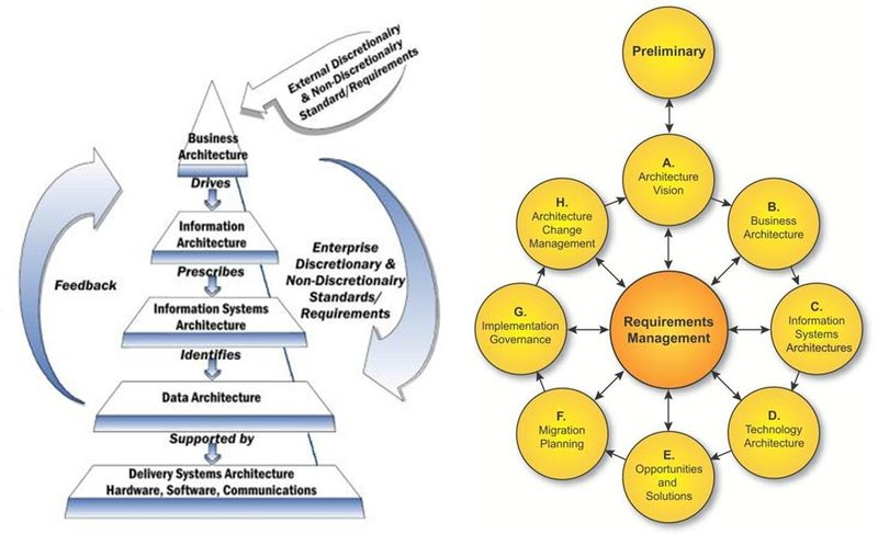
Take, for example, this well-known (in enterprise architecture circles, at least) representation of the TOGAF methodology and framework (The Open Group Architecture Framework, and don’t get me started about including “the” in an acronym).
 If I was going to write about TOGAF and wanted an accurate graphic to help illustrate my points, my choices are limited. TOGAF has enough moving parts and interconnected concepts that any graphic describing it well is going to have a large number of elements to it, each of which is going to require a label so you know what it represents.
Which means small type. But you’ll notice, if you expand the image you can actually read everything. As a steadfast opponent of oversimplification, I’m okay with this sort of graphic. It isn’t what I’m complaining about.
This is what I’m complaining about:
 When a presenter doesn’t render an image with a resolution high enough that the type is readable when expanded, it tells me there never was any intention to present actual information.
Whether or not it’s intentional or not, the message that’s being clearly delivered is, “I want to impress you with my sophisticated knowledge but don’t give you credit for having enough curiosity to want to understand this subject yourself, let alone the attention span you’d need to review the actual content.”
The message I take away: The presenter knows there’s sophisticated knowledge to be had about the given subject, hasn’t expended the effort to learn it, but wants you to think (s)he has.
Yes, I know. Most of the time you have no more interest in learning the details than the presenter has the ability to explain them. But don’t think of this as an opportunity for eyeball-glazing, mind-numbing boredom.
Think of it as a hobby. Some people collect stamps. Others collect coins, or rocks. You collect flustered responses to this phrase, inserted innocently into the presentation whenever you just can’t stand it anymore: “I can’t read the type. Would you please expand the view and walk us through this?”
Most likely, after apologizing for the poor resolution and some tap-dancing, the presenter will say something like, “Well, I’m not the right person to take you through the details, but I can bring that person to our next meeting.”
The second-to-last thing you want is another meeting (the last is to reward the presenter by agreeing to another meeting). So you say, “That’s okay. Just give me the high points.”
Or, “Will that person be working with us directly if we decide to do business with you?”
Or, “Maybe I’m misunderstanding the situation. Is that graphic on the page to provide information, or is it just decoration?”
Just keep in mind, this is a catch-and-release situation. Go ahead and play the fish until you get bored, but at some point you should let the presenter off the hook.
What’s even more annoying than this is that the trend toward unreadable graphics seems to be extending beyond face-to-face presentations to on-line and downloadable marketing, and even worse, to training material. There’s no defense — nobody to put on the spot and embarrass.
If you’re in a public service mood you might consider taking the time to send an email into the customer service black hole, to the effect that while going through the company’s on-line training course the graphic in question caught your eye, but its resolution was too low — could customer service please send you a readable version?
Maybe … just maybe you’ll eventually find yourself in touch with someone you can politely ask why on earth they’d include something that clearly does have text, but that just as clearly was never intended to be read, in their material.
But probably not.

Bob –
This makes me think of another pet peeve, the work produced by professional (should I air-quote that, I wonder) documentation specialists. So much of what passes for training materials is nothing but screen captures. A screen shows a picklist field with three values: A, B, and C. The documentation says, “Select A, B, or C.” Nothing about when A is appropriate or C would have disastrous results. Does B require more knowledge of the underlying system that should be included here in the material? Who knows? All the training material does is tell the reader the same thing he or she can read (same learning modality) on the screen. Maybe that’s why you get the graphics you dissed. The challenge has become how to fit it on one slide rather than how to communicate knowledge of the system.
I wonder if any of the presenters in your examples really know how to use graphics in a presentation? A good way to learn would be for a company that wants its employees to really be able to make their charts be use would be for that company to hire a competent research scientist to give a 3 to 5 day course on how to read review papers in the scientist’s field.
Even though few of the students would be able to understand much of the science, they could see that charts and graphs are mostly used to say things that can’t be clearly said in words, rather than entertain or repeat what’s already been said.
Charts add the additional dimensions necessary to for the reader to understand the paper is saying, not just certain parts. It’s taken me 10 years to get the point where I can see that without the graphs in a scientific paper, I really wouldn’t understand all of what the paper was talking about, no matter how well I understand the science.
To me, you should only add the graphs when they add something you can’t say in words or show in numbers. I think it takes real thought to know when or if you really need to add a chart, and if so, what kind of chart or graph to use.
Otherwise, it’s mostly a semi-innocent waste of everyone’s time, as I see it.
I don’t entirely agree. Some people are more verbal, others are more visual. I find that when I present a graphic and use text to walk readers through it, this tends to maximize comprehension.
There’s a relevant law of organizational dynamics called the rule of 7X7 – for the organization as a whole to understand something it has to be repeated seven different times in seven different ways.
‘Catch and release’ – love it! Wish I’d thought of that when watching such presentations.
I appreciate you taking the time to respond to my post. I found your feedback constructive.
I probably didn’t make my point clearly enough. I completely agree that people vary in their learning and communication styles. But one of the consequences of this natural diversity of styles, is that people who aren’t naturally visual, like me, won’t intuitive “see” when a graphic is needed and we won’t easily see which type is the right type of graphic use.
Your comments, to me, point out the importance of having the conceptual framework of people having multiple natural ways of doing things. But even when they have such a framework, many otherwise productive and valuable employees, won’t really “get” when to use those other communication modes without training.
My reason for suggesting hiring a research scientist to lead a training in reading scientific papers is that the employees are highly unlikely to have the background to understand the papers, and thus are forced for an extended period to look presentation mechanics without the distraction of assumed common knowledge, goals, and expectations. I know it’s an investment and it’s unorthodox, but I believe it’s one that could make a real difference in many companies.
Bob,
My number one pet peeve for 30+ years: Typos and grammatical errors in presentations. However, there is another pet peeve that is as offensive and has gained my ire: the use of acronyms that are not “qualified” when used.
Me: “I can’t read the type. Would you please expand the view and walk us through this?”
My colleague: “I can read it fine.”
Me: “I must be getting old.”
Colleague: “GETTING?!?”