Paul Krugman revisited the so-called “Great Resignation” and concluded it isn’t really a thing. You heard it here first. Thanks for the validation, Dr. Krugman, and for demonstrating the difference between calculating statistics correctly and interpreting them properly.

Sneering at statistics is a popular pastime, with lots of clever quotes from clever people to justify the derision, and high salaries paid to the data scientists who are good at it.

Statistics is hard to get right, even without the math. Failing to appreciate the stochastic nature of the world around us … that is, the randomness that’s intrinsic to so much of our experience … is a major reason so many of us so often draw the wrong conclusions.

Three examples, drawn from Daniel Kahneman’s brilliant Thinking, Fast and Slow, help illustrate just how easy misinterpreting statistical analysis is. Call them the bulls-eye effect, regression to the mean, and the small town fallacy.

Bulls-eye effect

The bulls-eye effect is familiar to anyone who has ever sighted in a rifle. Here’s how it doesn’t work: (1) Put the rifle in a clamp; (2) pull the trigger; (3) realign the site so its crosshairs are pointed at the hole in the target.

Do this and pull the trigger again. This bullet won’t pass through the hole created by the previous one, and the next shot you fire probably won’t pass through either of the previous bullet holes.

The trajectory of a fired bullet is stochastic, affected by random effects. Slight variations in bullet weight, propellant quantity and composition, wind, barometric pressure, humidity, and so on all influence the path each bullet follows on its way to the target.

To properly sight in a rifle you need to fire more than one round – statisticians would recommend 30, but 10 is probably enough. Then, as Figure 1 illustrates, adjust the sight so it points to the middle of the cluster of bullet holes you produced. And, accept that whenever you use the rifle you won’t be able to perfectly predict where the next bullet will fly.
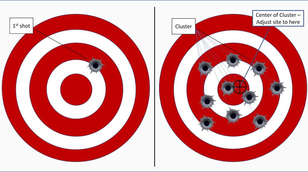
Figure 1 – The bulls-eye effect: Sighting in a rifle

No matter which business process or practice you’re dealing with, perfection will elude you because to a greater or lesser degree, all processes and practices are subject to stochastic effects.

Regression to the mean

A team member does poorly at an assignment. You chew them out, and they do better at the next one. Another team member handles their assignment well. You provide positive reinforcement … you compliment them. Nonetheless they do worse their next time out.

You draw the obvious conclusion: Negative reinforcement works, positive reinforcement doesn’t. And … you drew the wrong conclusion. As shown in Figure 2, if today’s performance is below average and performance is stochastic, tomorrow’s performance will most likely return to average – an improvement due solely to randomness, not negative reinforcement. This return to average is what statisticians call regression to the mean.
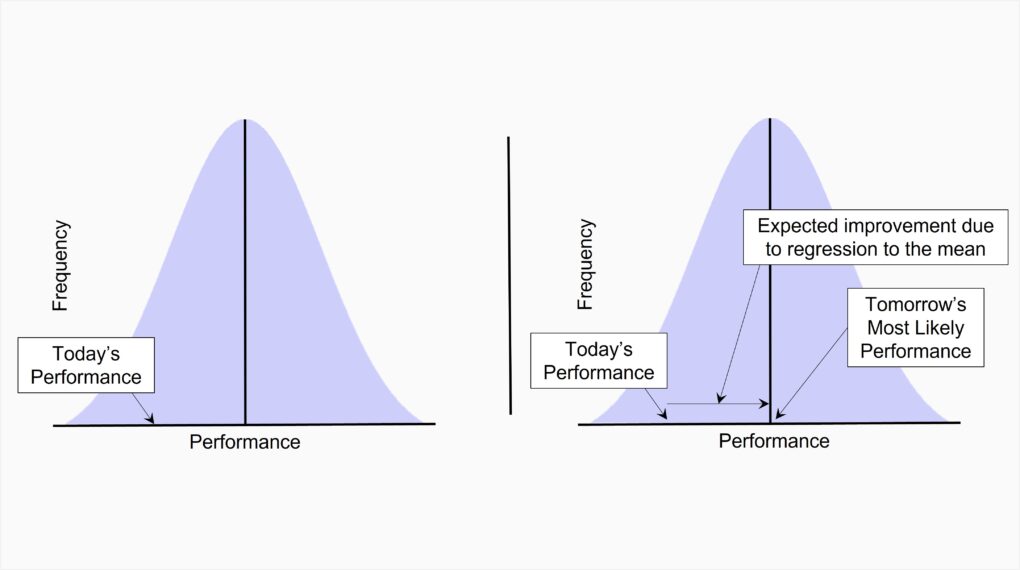
Figure 2 – Regression to the mean: Performance improvement

Small town fallacy

Imagine COVID-20 breaks out, and a preliminary analysis shows the top ten per capita hot spots are all small towns. What, you’d likely ask yourself, makes small towns more vulnerable?

The correct answer: They aren’t more vulnerable. At least for the purposes of this article’s hypothetical, the root cause is that small towns are both smaller and more numerous than big cities.

A thought experiment shows how this works.

Use a random number generator to model a population of 10 million cases: Randomly assign a 0 (COVID-free) to 5 million cases and a 1 (COVID-positive) to the other 5 million.

Establish 10 clusters and randomly assign 500,000 cases to each. These are the large metropolitan areas. Calculate the mean per capita rate of infection. All ten will be close to 50%.

Divide the remaining 5 million cases into randomly-selected clusters of 1,000, corresponding to 5,000 small towns. Compute the mean per capita rate of infection for each of them.

The outcome: The rate among the small-town (1,000-case) clusters will, because of their much smaller sample sizes, vary more widely than the metro areas. Some will have much higher rates, and just as many will have much lower rates.

So even if differences in COVID-20 per capita incidence are due solely to stochastic effects, major metropolitan areas will exhibit rates close to the overall 10 million case mean. Smaller municipalities will occupy the most extreme positions on the incidence scale – some will exhibit the highest rates of infection, others the lowest.

Bob’s last word: Stochastic thinking is hard, requiring constant vigilance. You’ll make a good start by familiarizing yourself with common statistical errors. This, from Wikipedia, is a good place to start.

Bob’s sales pitch: CIO.com has launched my bi-weekly feature, the “CIO Survival Guide.” It’s up right now for your interest and edification: The CIO’s missing priority .

When thinking about thinking, as we have been, you’d think mind-mapping would be the best way to go about it based on nothing more than its name alone.

And it can be. But …

Every time I research the topic I’m left with the indelible impression that its proponents don’t understand topology. There is, for example, this prescription, taken from Wrike’s website:

  1. Choose the topic of the mind map and place it in the middle of the drawing
  2. Come up with three to five+ main ideas, then evenly space them in a circular formation around the mind map topic
  3. Draw a line from the mind map topic to each main idea
  4. Brainstorm supporting details such as ideas, tasks, and questions for each main idea
  5. Draw lines connecting each main idea to its supporting details

To which I’ll add a suggestion: Consider using Post-it® notes rather than a marker to add ideas to the map, and use magnets and strings to connect related ideas rather than drawing lines. Post-its® magnets and strings let you rearrange your ideas if you need to.

Topologically speaking, mind maps and outlines are identical, just as donuts and soda straws are identical. The visualizations differ, but not the underlying associations. Both techniques (outlines and mind maps that is, not donuts and soda straws) result in sets defined by one-to-many relationships.

Outlines do differ from mind maps in that they imply a sequence, where mind maps do not. For outlines this is both a weakness and a strength. It’s a weakness because often, an outline’s sub-topics and sub-sub-topics have no logical sequence – they’re parallel to each other. It’s a strength because when the time comes to explain the subject, the presenter will have to sequence them because of the nature of Time as one of the four dimensions of Newtonian physics.

From a process perspective, mind maps differ from outlines in that they’re more useful for a group exploring a subject – in a word, brainstorming. Different participants can attack different subject areas at the same time without interfering with each other.

At least, mind maps were more useful for brainstorming when everyone could gather in the same room. Mind maps depend on having a large space to draw on. Virtual or hybrid meetings can’t provide this – they’re limited to what will fit on a computer screen, reducing mind-mapping’s brainstorming advantages.

Which gets us to a related but less-well-known approach called Concept Mapping, explained quite well here: https://www.xmind.net/blog/en/concept-map-vs-mind-map/. What concept mapping adds to the party is its ability to handle many-to-many relationships. This is useful because with almost no exceptions, the information needed to fully comprehend a subject includes many-to-many relationships. Many many-to-many relationships, in fact.

As a simple and familiar example, take Cooking. Whatever dish you plan to prepare will have ingredients. That’s a one-to-many relationship, with dish being the one and ingredient being the many. But each ingredient can be used for preparing more than one dish, making, ingredient the one and dish the many.

Put them together and the relationship between dish and ingredient is many-to-many, and neither outlining nor mind mapping gives you the tools you need to represent it.

Concept mapping does.

Which led me to this brilliant insight: Concept mapping and the Entity/Relationship Diagrams familiar to professional data designers are one and the same thing.

Sadly, the brilliant insight wasn’t mine: The credit apparently belongs to Ron McFadyen and dates back to at least 2008: https://www.google.com/url?sa=t&rct=j&q=&esrc=s&source=web&cd=&cad=rja&uact=8&ved=2ahUKEwiOvfDK2_D2AhUPXc0KHfncC2IQFnoECAcQAQ&url=https%3A%2F%2Fazslide.com%2Fconcept-maps-for-data-modeling-ron-mcfadyen_5a7963751723dd2cfaa4179e.html&usg=AOvVaw1R_5IAQj5BnXMHa9IVmCZ6

Oh, well.

Which tool should you use to think through whatever it is you’re thinking through? I figure it this way:

  • Use mind maps when it isn’t just you thinking things through. They’re visually more interesting than outlines, and while they’re limited in depth, they’re the easiest of the three to grasp at a glance.
  • Use outlines when it’s just you and you need to explore a subject in depth.
  • Use concept maps when technically accurate and complete, in-depth representation matters more than at-a-glance interpretation.

Bob’s last word: Don’t limit yourself to just one of these techniques. As a general rule, start out with either an outline or a mind map. Use that as a starting point to create a concept map.

How to explain your thinking to someone else? That’s an entirely different rabbit hole – one that depends on who you’re going to explain it to, why, and in what circumstances.

Bob’s sales pitch: Ever need a sympathetic ear (just one) and an independent pair of eyes (two) to look at your situation? Not every consultation has to be a team working for weeks. If a one-hour Zoom conversation is all you need, I’ll be happy to help, too. Get in touch (Contact – IS Survivor Publishing ) and we’ll figure out what makes sense.