If you don’t want anyone to read something, don’t put it on the slide.
The latest in PowerPoint fashion is to include complex graphics with unreadable labels.
It’s bad enough when a graphics designer decides to use mouse type to label the boxes in a graphic. But sometimes there are no good alternatives.
Take, for example, this well-known (in enterprise architecture circles, at least) representation of the TOGAF methodology and framework (The Open Group Architecture Framework, and don’t get me started about including “the” in an acronym).
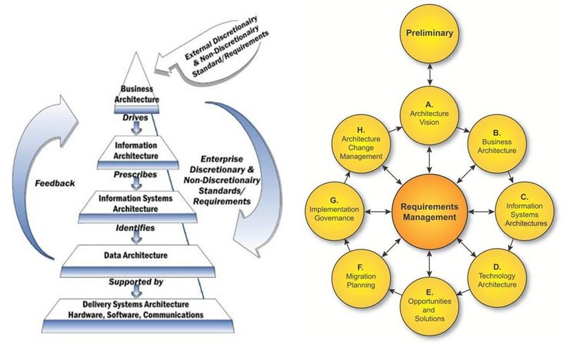 If I was going to write about TOGAF and wanted an accurate graphic to help illustrate my points, my choices are limited. TOGAF has enough moving parts and interconnected concepts that any graphic describing it well is going to have a large number of elements to it, each of which is going to require a label so you know what it represents.
Which means small type. But you’ll notice, if you expand the image you can actually read everything. As a steadfast opponent of oversimplification, I’m okay with this sort of graphic. It isn’t what I’m complaining about.
This is what I’m complaining about:
 When a presenter doesn’t render an image with a resolution high enough that the type is readable when expanded, it tells me there never was any intention to present actual information.
Whether or not it’s intentional or not, the message that’s being clearly delivered is, “I want to impress you with my sophisticated knowledge but don’t give you credit for having enough curiosity to want to understand this subject yourself, let alone the attention span you’d need to review the actual content.”
The message I take away: The presenter knows there’s sophisticated knowledge to be had about the given subject, hasn’t expended the effort to learn it, but wants you to think (s)he has.
Yes, I know. Most of the time you have no more interest in learning the details than the presenter has the ability to explain them. But don’t think of this as an opportunity for eyeball-glazing, mind-numbing boredom.
Think of it as a hobby. Some people collect stamps. Others collect coins, or rocks. You collect flustered responses to this phrase, inserted innocently into the presentation whenever you just can’t stand it anymore: “I can’t read the type. Would you please expand the view and walk us through this?”
Most likely, after apologizing for the poor resolution and some tap-dancing, the presenter will say something like, “Well, I’m not the right person to take you through the details, but I can bring that person to our next meeting.”
The second-to-last thing you want is another meeting (the last is to reward the presenter by agreeing to another meeting). So you say, “That’s okay. Just give me the high points.”
Or, “Will that person be working with us directly if we decide to do business with you?”
Or, “Maybe I’m misunderstanding the situation. Is that graphic on the page to provide information, or is it just decoration?”
Just keep in mind, this is a catch-and-release situation. Go ahead and play the fish until you get bored, but at some point you should let the presenter off the hook.
What’s even more annoying than this is that the trend toward unreadable graphics seems to be extending beyond face-to-face presentations to on-line and downloadable marketing, and even worse, to training material. There’s no defense — nobody to put on the spot and embarrass.
If you’re in a public service mood you might consider taking the time to send an email into the customer service black hole, to the effect that while going through the company’s on-line training course the graphic in question caught your eye, but its resolution was too low — could customer service please send you a readable version?
Maybe … just maybe you’ll eventually find yourself in touch with someone you can politely ask why on earth they’d include something that clearly does have text, but that just as clearly was never intended to be read, in their material.
But probably not.